Everytime I go to write a post I can't believe another week has gone by! Does that ever happen to you??
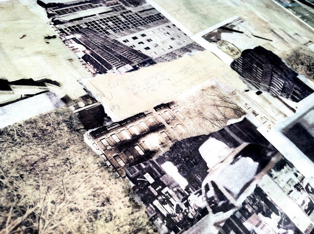
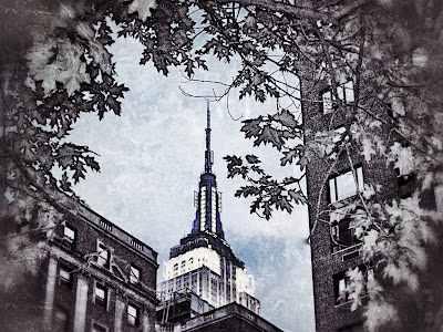
This weekend I toyed around with one of my digital collages of NYC in Procreate on the iPad. The original is the bottom photo with the blue and copper tones. After having altered it to the lighter tones I am not sure which one I like best. Actually I think it may be the lighter version on top!
Thought they would make cool note cards. I miss hand written sentiments these days. I better get to writing out some of these! lol
I will also most likely be adding them to my etsy shop. ;)
Which color tones in these pics to you prefer? Would love input from you guys too!
xo


